Tuesday, October 11, 2022

...on perspectives

Perspective is what we see when we look towards an horizon in nature, or towards an object that prevents further visibility  – which it always does in fact, even out at sea. By looking towards, and then beyond the horizon, perspective presents the illusion of reality through suggesting an invisible distance on a flat surface – as in a photograph or painting. Accurately representing three-dimensional perspective in art is a skill exercised through a combination of observations and mathematical grid measurements, thereby engaging the eye to look towards an unseen, hidden and imaginary vanishing point beyond the horizon, and mimicking the eye’s natural focus.  

David Hockney in ‘Secret Knowledge’ (2006, Thames & Hudson) revealed another ‘lost’ technique that advanced the search for naturalism and a realistic visual perspective. It was the use of optical devices over the mathematical lineal grid, especially for portraiture by which the rise of realism took hold. The ‘camera obscura’ (dark room), containing a glass lens, was a tracing device that was particularly useful in transferring flat patterns into a 3D illusion, such as folds in clothes – and faces. Many of the portraits Hockney researched were of the same size,  about 30x30cms, and of course being portraits the greater the likeness the more acceptable it would be.


Although there is no vanishing point evident, the illusion of an horizon is a powerful way to view this quilt, where the unseen (that which is beyond of the horizon) comes forward to be visibly present, and what is obviously visible on the surface recedes. Reading the quilt holistically, that is in terms of the Earth and the wider Universe, there is no left to right, nor is up/down fixed – both can be seen in reverse and on a wide variety of angles. As we know, no two sunrises or sunsets are the same. They depend on all sorts of factors: the time difference between daylight and dark hours over the seasons; weather conditions, place and time of observation. Such is the wonderful world of the imagination that is aroused through creating art. The sense of wonder, combined with a desire to leave my own impressions of these natural phenomena, persisted in spite of the material limitations. 
This wall hanging is a celebration of both sunrise and sunset, beginnings and endings - in all their glory. It reminds us to 'carpe diem' – every single one that we have the fortune to live in.


Saturday, October 8, 2022

Carpe Diem : inspiration for the design

Although the quilt started to take form in my internal reflections, finding new relationships between colours, and the means to bring the influences together, the structure had unknowingly always been there. I just needed to find it. Creative acts absorb influences from their lives, from other artists. Initially thinking strata formation as representing horizons, I went to my folder of design ideas and came across several A4 colour copies of the work of German/Swiss visual artist Paul Klee, working with the Cubist movement. I was no doubt attracted to the abstract nature of his angular paintings when I collected the prints as they resonated strongly with the grid of patchwork design – though in a more free form. I tend to muse that he could have been a quilter!
I chose one work as my ‘inspirational’ template, no doubt because of its horizontal stratification, and drew up a strategy for building the quilt based loosely on Klee’s elements of design. The name of the work that was produced in 1929 is 'Monument in a Fertile County'(as seen above). The usual process of creating fabric patches by joining strips was confined by size requirements. Then the fabrics had been previously cut into various lengths of about 1’6” (450mm), no wider than 4” (100mm, and many of them had already been sewn together. There had come a point to make a decision. Following the lead of Klee’s striations I would work on building roughly 7” wide striations, roughly 12” long for the width. To arrive at the desired length of 3’4” (1000mms) meant building nine or ten thirty-six inch long strata. It all seemed a bit random. To add a further random element, when each strip was completed it was stitched to the previous one, forming horizontal layers and parallel lines.
I found it interesting to read that Klee experimented with colour, both complimentary according to contemporary painterly usage, and also with colour dissonance that could be explored through abstractionism. Klee used blocks of colours designated by ‘pure’ geometric measurements, halving or doubling strips where layers cross on the vertical, creating points at which each block of strips intersected with the others. A lot can be said about Paul Klee, his life and artworks, a German Jew who fled to Switzerland during the Nazi regime. It’s somewhat incongruous that his works were both banned - and stolen - by perpetrators of the regime. But one quote is notable: when conceiving a view in this way, he suggested that it might “find its way back to reality”. This brought up the notion of perspective for me, which I'd considered as part of my PhD research.

Monday, October 3, 2022

Carpe Diem: the fabrics

As I mentioned in a previous post of Leo’s quilt (July ’22), I’d been collecting many of these vibrant fabrics from Dianne Johnston and other hand-dyers over many years. They had been collected for their sheer beauty. Some were destined to become part of a double bed quilt, envisaged by the images of outer space returning to us on Earth via satellite from millions of light years ago. I fancied sleeping under the stars in the comfort of my own bed! Grand, universal limitless space became transformed into the perhaps less grand, but regular events of our journey round sun, witnessed daily on our doorstep, sunrises and sunsets. And continuing the journey with such hand-dyed fabrics, they spoke to me of sunrises and sunsets, of dawn and dusk, the real experience of witnessing Earth’s journey around Sun - and all the metaphors and myths it has given rise to. 

 In my creative journey for designing this smaller quilt boundaries related to size were established. It was to fill a specific space on a wall in a bedroom. Every work of art has a purpose, concealing the artificial division between craft and what we call and revere as ‘the fine arts’. This time its purpose was to cover the unwanted sight of the frame of a small ‘dead’ air conditioner in the bedroom. The design is often limited by space. Space is what constrains – and necessarily designates design, spaces in which reside concept, skills and utility. 

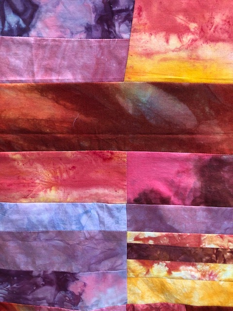
 Cause and effect can be misplaced in the act of creation: we create in the process, the outcome often being as yet unseen, not yet eaten or worn, etc. I don’t have the creative gene in the same way that I have hazel eyes. The will to create has me in its grip. Creativity is definitely in the process rather than in the genes, rather than being 'talented' as is generally presumed. It’s about need, passion and will in equal share, and importantly, the opportunity to express them. Over many cycles of designing quilts, I have consciously tried to ignore the limitations of the well-known colour wheel with its normative suggestions of complementary colours. Fabric has its own limitations. Even though not showing commercial patterns, all fabric is fixed in colour and immutable, unlike a pallet of mixable paint colours. One of the pleasing aspects of hand-dyes is their streaky, blotchy nature, so that a deep red background can also reveal an orange and yellow splash, with a hint of blue. A marbled orange can hide hints of deep purple. And of course it’s all about movement, the changing reflections of Earth’s surface on its daily travels in the annual migration round Sun. 
It's trite to say that sunrises and sunsets are infinite, limited only by people's reactions. I started to collect images for inspiration from friends' photos on Facebook onto my computer. The truly spectacular and dramatic display of the setting sun can be breathtaking. From where I am situated on Earth, facing to the northeast, sunsets are less pronounced. But to watch the almost 180 degrees spread of the morning Sun’s incandescent glow arising in the darkness, emerging behind the bush surrounding the house, elicits immense awe and gratitude.

Other less conscious boundaries can occur through limitations placed on us by our perception – or the dis-ability to perceive differently. It took some time during the early stages to come to the understanding that my original plan was not only NOT going to work, but was unnecessary – coming from the way we usually see sunrises and sunsets: as horizontal; and distinct, and used to admiring the glorious colours of a summer sunset taking precedence over sunrises. As I was unravelling the relationship between sunrises and sunsets, I started to see the similarities in the time of day, at both the rising and setting of the sun. Instead of sunrise bands alternating with bands of sunset, I could see the colours in the fabrics merging into morning and evening horizons, each phenomenon becoming interchangeable. Oranges, yellows and blues are there on both occasions, at the start and end of the day, just as all shades of mauve and pink that streak the sky or light up floating clouds can be present in at both the beginning and ending of the day. The darker purples, ochres and grey-greens can recall the impending squall of a storm over the horizon, or the deepening descent of the night sky. 

 The fabrics started talking through the jangling clatter of my indecisiveness that had been rattling around in my head, I began to play by putting fabric strips beside each other, moving them to another strip, or returning them to their original place. Other ways of seeing became apparent. I started to listen to their suggestion that I had let go of the limitations I'd placed by trying to imitate or re-present and even sequence the beauty of Earth’s embrace of Sun. The fabrics were acknowledging not only their own limitations, but also other colour combinations that would work both horizontally and vertically for the composition, helping me to make the connections between these two magical cosmic phenomena. It was becoming clear that the quilt would be content to render an impression, rather than a distinct representation of sunrise and sunset, as I began learning to let the fabrics take the direction - instead of my ideas. More to come in next post.